
Wave Sketches is Wave’s design workspace for turning ideas into editable screens, components, and visual assets. It brings a layered canvas, vector tools, layout controls, reusable components, variables, code inspection, and export options into the same environment as your team’s work.
This guide walks through the current Wave Sketches editor and a practical customer portal example, so you can see what the tool is for and how its features fit together.
Watch the Wave Sketches showcase
The 48-second showcase uses actual Wave UI components with fictional Northstar Studio data: six library entries and a populated design containing three pages, more than 100 layers, six components, and nine variables. The sample names, customer details, and metrics are illustrative. The video is a composed product demonstration, not a recording of production collaboration.
What can you make with Wave Sketches?
Use Wave Sketches for interface concepts, customer portal layouts, onboarding screens, reusable UI elements, landing-page artwork, and design handoff. Start with the outcome you need to explain, then choose a level of detail that helps the next person make a decision.
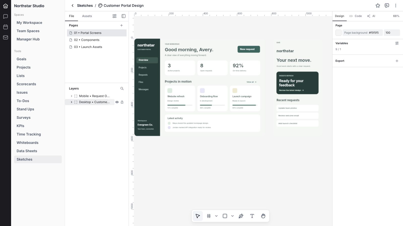
In the example, a desktop portal gives a customer an overview of projects, requests, and recent activity. A mobile frame simplifies the next action. A components page holds recurring interface elements, and a launch page develops the same visual language into a campaign hero.
Current availability: Sketches is evolving, and availability can vary by workspace. This guide describes the reviewed editor rather than promising complete feature parity with another design tool. The AI panel states that Atlas integration is pending; AI image or icon generation is not a working feature demonstrated here.
Keep design work organized
1. Create a sketch with a clear purpose
Start a sketch with a title, optional emoji, team assignments, owner, priority, and status. Name the outcome your team needs: a customer portal, an onboarding flow, or launch artwork. A useful title makes the design easier to find before anyone opens the canvas.
2. Give designs an owner, status, and priority
The library brings Title, Priority, Owner, Updated, and Status together. Update the work properties as a design moves from planning through review and completion. The Details panel keeps this context with the sketch, so responsibility does not depend on a filename or a separate message.
3. Search, filter, and adjust the library
Search sketches by name and narrow the library with filters such as status, owner, priority, and update date. Display settings adjust the library view. This is especially useful when a workspace contains active product work, older concepts, brand files, and marketing designs at the same time.
4. Favorite the designs you return to
Favorite sketches to bring them into the library’s Favorites area. Keep the current portal design and component reference close at hand while the wider list holds the rest of the team’s work. Favorites provide a quicker route back to frequently used files.
5. Manage selected sketches together
Select library rows to work with multiple sketches through the available bulk actions. Archiving provides a way to retire a design from active work. An archived sketch opens read-only, while export remains available. Treat deletion separately from archiving when deciding how to manage older work.
Navigate pages, layers, and the canvas
6. Separate work into design pages
A sketch can contain multiple pages. Add, rename, reorder, and remove pages as the work develops. The sample document has Portal screens, Components, and Launch assets, keeping the interface, reusable elements, and campaign artwork together without crowding a single canvas.
7. Organize the layer hierarchy
The Layers panel shows the structure of frames, groups, text, shapes, components, and their children. Expand or collapse nested layers, rename them, change their order, and move selections between pages. Descriptive layer names make complex designs easier to review and hand over.
8. Search, hide, and lock layers
Find a particular layer through layer search. Hide elements while exploring alternatives, and lock elements that should stay in place. These controls help when selecting small details inside a large frame or working on a layout with several overlapping shapes.
9. Pan, zoom, and use rulers
Move around the canvas with the Hand tool and zoom controls. Zoom to a useful overview or focus on a selection when checking detail. Rulers and canvas guides help you judge positioning, while resizable panels let you balance room for the artwork and its properties.
10. Compare designs with split canvas views
Split the canvas to the right or below, with up to four views in the current editor. Each view can keep its own page and viewport while sharing the document. Compare a component with a screen, or keep a broad overview beside the detail you are editing.
Draw and refine the design
11. Create frames, sections, shapes, and text
The drawing toolbar includes Move, Frame, Section, Rectangle, Ellipse, Line, Polygon, Star, Pen, Text, and Hand tools. Use frames to contain screens and sections to organize areas of the canvas. Combine simple shapes and text into interface elements, diagrams, or campaign artwork.
12. Edit vector paths and points
Use the Pen tool to draw vector paths, then edit their points and curves. This provides a way to refine custom marks and shapes inside the same document as the screen design. Vector editing complements the preset shapes when a design needs more specific geometry.
13. Combine and convert shapes
Boolean operations include union, subtract, intersect, and exclude. Flatten selections to vectors, outline strokes, or convert text to outlines when the design calls for it. Keep an editable source version when outlining text, because the outlined result is no longer ordinary editable text.
14. Group, frame, and arrange selections
Group related objects, ungroup them, or wrap a selection in a frame. Bring layers forward, send them backward, and align or distribute objects. These commands help keep repeated structures orderly and make it easier to manipulate a whole interface element as one selection.
15. Use masks and clipping
Use a layer as a mask and control the mask type where supported. Frames can also clip their contents. Masks and clipping are useful for containing imagery, shaping visual treatments, and keeping content within a screen or card boundary.
16. Set position, size, rotation, and corners
Inspect and edit X and Y coordinates, width, height, rotation, flips, opacity, corner radius, and corner smoothing. Shape-specific controls include polygon and star points, inner radius, and ellipse arc or ring settings. Precise values make it easier to reproduce a consistent treatment.
Build layouts that hold together
17. Apply horizontal and vertical auto layout
Add auto layout to a frame and choose horizontal or vertical flow. Adjust spacing, padding, alignment, wrapping, and sizing behavior to organize its children. Use it for button groups, navigation, lists, and other structures where consistent spacing matters as content changes.
18. Arrange content with grid layout
Grid layout provides another way to organize children into rows and columns. Configure the grid and the placement of items within it. A grid suits repeated cards, dashboard sections, and other layouts that need an explicit relationship across both dimensions.
19. Control resizing and constraints
Set how layers resize and how they relate to their parent. Depending on the layer and layout, controls include fixed dimensions, content-based sizing, fill behavior, minimum and maximum dimensions, and horizontal or vertical constraints. These are design-layout controls; they do not by themselves deploy a responsive website.
20. Add layout guides
Add square grids, columns, or rows to supported frames. Adjust settings such as count, gutter, margins, color, and visibility. Guides provide a reference for consistent alignment while you build the design; they are separate from the objects that make up the artwork.
21. Start with frame presets
Frame presets provide common starting dimensions for screens and other design formats. Choose a suitable size, then refine it for the project. The demo uses separate desktop and mobile frames to explore the same portal experience at two sizes.
Set color, effects, and typography
22. Work with multiple fills
Add and edit fills, including solid colors, gradients, images, and noise treatments. Adjust opacity and blend behavior, reorder fills where available, or hide an individual fill while comparing alternatives. Gradient controls include stops and gradient type, helping you refine a treatment within the editor.
23. Style strokes
Control stroke color, width, alignment, and visibility. Advanced settings include dash patterns, caps, joins, and miter limits, with independent sides available for supported shapes. Use strokes for subtle card boundaries, stronger emphasis, or custom vector treatments.
24. Add effects and blending
Add effects such as shadows and blur, then tune the available parameters. Layer and paint blend modes provide further control over how elements combine. A restrained shadow or a small contrast adjustment can make hierarchy clearer without adding more objects to the screen.
25. Choose fonts and text formatting
Select a font family, weight, size, line height, and letter spacing. Set horizontal and vertical alignment, direction, case, and common formatting such as bold, italic, underline, and strikethrough. Text resizing controls let text grow with its content or stay inside a defined area.
26. Use advanced typography controls
Font settings include options for ligatures, kerning, contextual alternates, language, variable-font axes, and OpenType features. Additional controls cover truncation, maximum lines, and text decoration. Available results depend on the selected font and the capabilities it provides.

Reuse components and design variables
27. Turn repeated elements into components
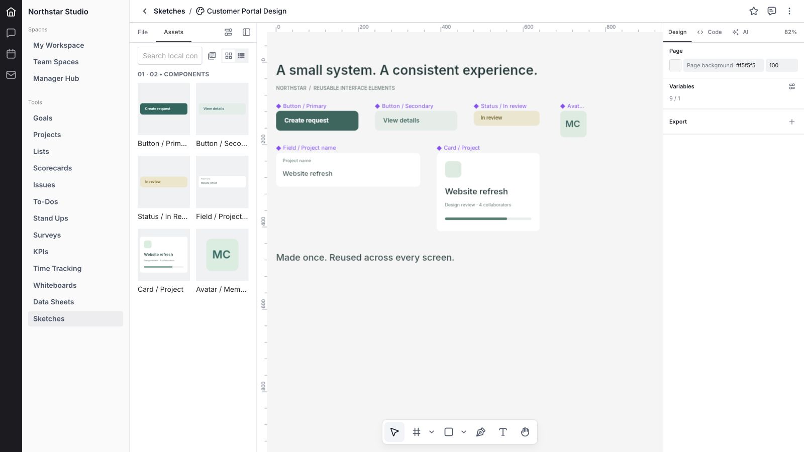
Create a component from a selection to establish a reusable source. The sample includes primary and secondary buttons, a review badge, a project-name field, a project card, and a member avatar. Components give recurring elements an explicit place in the design system.
28. Combine components as variants
Combine compatible components into a component set and use variant properties to represent related options. This can organize differences such as a button’s appearance or state. Component properties provide controls for supported text, visibility, and instance-related values.
29. Work with instances
Create an instance of a component, navigate back to its main component, or detach an instance when it needs to become independent. Instance controls and supported overrides let a reusable element carry context while retaining its relationship with the source component.
30. Browse local assets
The Assets tab lists local components with previews, search, and grid or list display. Insert them into the canvas to reuse the work. The current demo shows six populated component previews. Shared-library publishing is not demonstrated; the reviewed Manage libraries control does not provide a working library-management flow.
31. Define typed variables
Variables support color, number, text, and boolean values. The sample includes four brand colors, spacing, card radius, heading size, a product name, and a visibility flag. Typed values make the purpose of a token clearer than a collection of unrelated hard-coded settings.
32. Bind supported properties to variables
Apply variables to compatible properties through the inspector. Supported bindings include paint colors and numeric properties such as dimensions, radius, opacity, and font size, with text and visibility bindings in the document model. Use compatible types so a value makes sense for the property receiving it.
33. Keep variables in document collections
The variable editor presents the document’s variables and their collections. Edit names and values, add variables, and remove unused entries. Collections keep related tokens together. The sample uses one Northstar foundations collection; this showcase does not imply a published, cross-workspace token service.

Bring work in and hand it over
34. Import native design documents
Import supported design documents, including .fig and .pen files. Imported content becomes part of the editable design workflow. Compatibility depends on the file and its features, so inspect important imports before relying on them; this guide does not promise complete parity with another design application.
35. Place images and SVG artwork
Place image and SVG assets into a sketch to build on existing visual material. This is useful for logos, reference imagery, icons, and other assets that belong in a design. Inspect the imported result and keep the original source asset when fidelity matters.
36. Import HTML and CSS as design content
The Import HTML / CSS dialog accepts HTML and optional CSS and converts supported static content into editable design layers. It is a useful starting point for exploring an existing layout. It does not run an application, reproduce every browser feature, or turn an arbitrary website into a fully functional product.
37. Copy, paste, and duplicate selections
Copy and paste design selections, duplicate objects, or paste to replace a selection. Additional copy formats include text, SVG, PNG, and JSX where supported. Clipboard behavior depends on the browser and the source content, so check the result when moving between applications.
38. Inspect Design JSX and Tailwind JSX
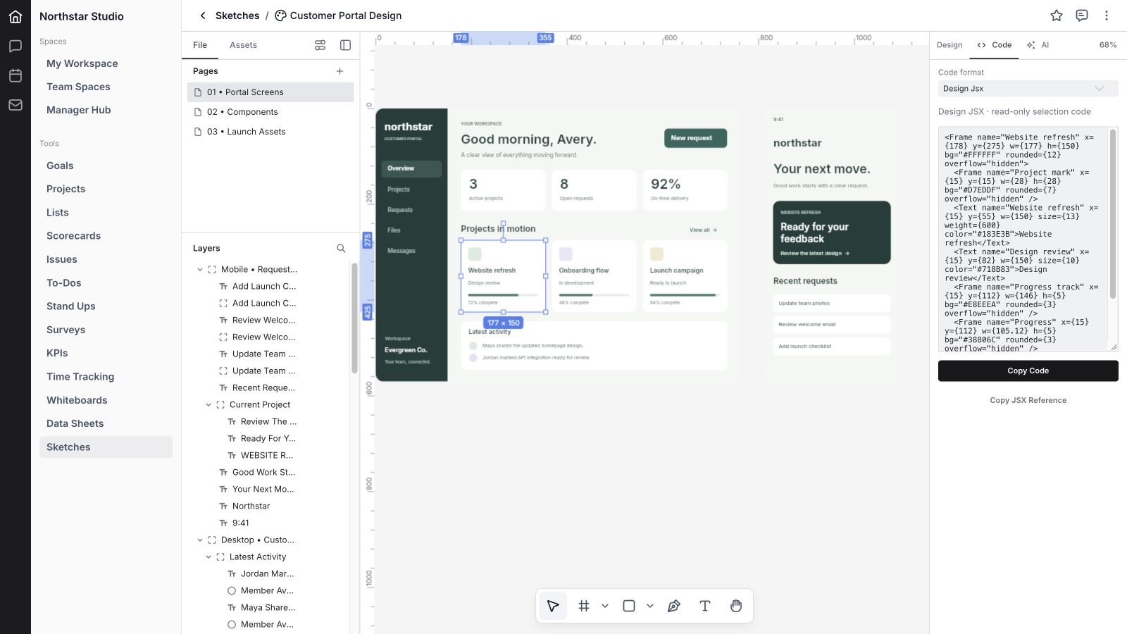
The Code tab generates read-only code for the selected design. Switch between Design JSX and Tailwind JSX, then copy the code or a JSX reference. This helps explain structure and styling during handoff. The output still needs engineering review, application behavior, accessibility work, and integration before production use.
39. Export design files, images, vectors, and presentations
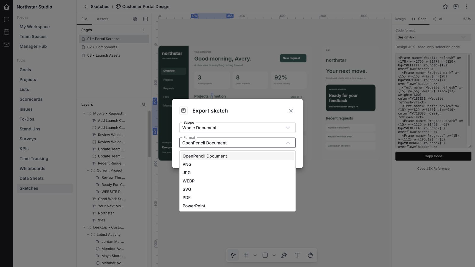
Export options include the native OpenPencil .fig document, PNG, JPG, WebP, SVG, PDF, and PowerPoint. JSX export is available for supported selection scopes. Choose the format that fits the next step: an editable design, a review image, a vector asset, a document, or a presentation.
40. Choose export scope and quality
Choose the whole document, current page, or selection where the format supports it. Raster options include scale, with quality controls for JPG and WebP. For whole-document export, formats other than native .fig and PowerPoint export the first page; choose Current page or Selection when you need a specific part.
41. Save export presets and batch outputs
Attach export presets to supported layers for PNG, JPG, WebP, SVG, or PDF. Presets retain a useful format and scale for repeat exports. Multiple outputs can be collected into an archive, making recurring asset delivery easier to repeat consistently.
Review, collaborate, and recover work
42. Keep comments with the sketch
Open the sketch’s comments panel to discuss the design in context. The shared comment workflow supports conversations around the file. Use feedback that identifies the page, element, and desired outcome so a teammate can turn the discussion into a clear design change.
43. Collaborate in a shared document
Sketches includes a live collaboration connection, shared document changes, and collaborator presence. Cursor visibility can be controlled in the editor. The showcase uses an isolated sample document and does not simulate a live multi-user session or claim a separately tested production collaboration result.
44. Save progress and handle connection problems
The editor connects saving and automatic checkpoints with Wave’s document service. When saving or connection problems occur, it can surface retry and recovery information, including a browser recovery copy when available. Watch the document’s status before closing work; local recovery is not a substitute for a confirmed save.
45. Review version history
Version history lists saved revisions and provides a restore action for eligible older versions. Restoring is a deliberate change to the shared document. The current restore flow retains the present version in history and tells other editors to reload, so coordinate a restore with the people working in the file.
46. Respect archived and unavailable-access states
Archived sketches remain read-only with export available. The editor also responds when access becomes invalid or is revoked. These states help distinguish a design you can inspect from one you can continue editing, rather than leaving the document’s status ambiguous.
47. Use shortcuts and the command palette
Use the command palette and keyboard shortcuts for common edit, arrange, view, and file actions. Undo and redo support local editing, while panel visibility and fullscreen controls help focus the workspace. Learn a few frequent commands first, such as Move, Text, Frame, duplicate, and zoom.
48. Move between the design and its Wave context
The shared header provides the sketch switcher, favorites, comments, details, version history, import and export actions, and ways to copy the URL or ID. Keep design review connected to the team’s broader work by referencing the sketch from the relevant project or conversation.
A practical first workflow
- Define the decision. Create a sketch for one outcome, such as reviewing a customer portal before development.
- Organize the document. Add pages for screens, components, and launch material. Name the frames and layers so others can navigate them.
- Build a believable example. Use realistic sample content, states, and actions. Show what a customer would actually need to do.
- Create consistency. Reuse components and variables for repeated elements, colors, spacing, and typography.
- Review and hand off. Collect comments, inspect the selected design’s code, and export the right page or asset for the next step.
How Sketches fits with other Wave tools
Use Wave Whiteboards to map the idea or explore a journey, then use Sketches to give the screens and assets a more precise visual form. Use Wave Projects to coordinate delivery, Wave Chat for team conversation, and Wave Knowledge for decisions and guidance that should last beyond a review.
These are complementary workflows. A design does not automatically create a project, ship a website, or become a production application.
Frequently asked questions about Wave Sketches
What is Wave Sketches?
Wave Sketches is a design tool inside Wave for creating and organizing layered screens, vector artwork, reusable components, and visual assets. Its editor includes pages, layout and typography controls, variables, code inspection, and import and export workflows.
How is Wave Sketches different from Wave Whiteboards?
Whiteboards is useful for flexible visual planning, workshops, diagrams, and shared exploration. Sketches focuses on more structured design work with frames, precise properties, components, variables, and code inspection. Use the tool that matches the decision or deliverable you need.
Can I design desktop and mobile screens?
Yes. You can create multiple frames with different dimensions and organize them on one or more pages. The sample demonstrates desktop and mobile portal concepts. Layout controls help shape those designs, but implementing and testing the final responsive product remains a separate development step.
Does Wave Sketches support components and variables?
Yes. The current editor supports local components, instances, variants, and typed variables. Variables can hold colors, numbers, text, and boolean values, with bindings for compatible properties. Shared-library management is not presented as a completed feature in this guide.
Can I import Figma files?
The design importer supports .fig documents. Compatibility depends on the contents of the file, so inspect imported pages, fonts, components, and other important details. This showcase does not certify complete Figma compatibility or lossless round trips.
What formats can Wave Sketches export?
The editor offers native .fig, PNG, JPG, WebP, SVG, PDF, and PowerPoint exports, with JSX for supported selections. Available scope and settings vary by format. For most non-native whole-document exports, the first page is used; select a page or selection explicitly when needed.
Can Wave Sketches generate a working website with AI?
The reviewed AI panel says Atlas integration is pending. The working Code tab provides read-only Design JSX and Tailwind JSX for selections. That output can help handoff, but it is not an automatically deployed or complete application.
Can a team collaborate and recover older versions?
Sketches includes shared-document collaboration, comments, saved revisions, and version restoration. Production behavior depends on access and connection state. The showcase verifies the design editor with fictional local data; it does not claim a two-user production or recovery test.
Bring the design into the work
Wave Sketches gives your team a place to develop the visual details behind an idea: the screen a customer sees, the component a designer reuses, and the asset a teammate needs next. Start with a focused design, make the example useful, and keep the discussion close to the file.
Explore Wave and check which tools are available in your workspace.


